Why do AI company logos look like buttholes?

If you pay attention to AI company branding, you'll notice a pattern:
- Circular shape (often with a gradient)
- Central opening or focal point
- Radiating elements from the center
- Soft, organic curves
Sound familiar? It should, because it's also an apt description of... well, you know.
A butthole.
The circular AI logo epidemic
If you ever thought that AI company logos look like buttholes, you're not alone.
FastCompany noticed this trend in 2023 and published an article about it, but (I could only presume) their editors and lawyers didn't let them title the article the way the wanted it to title, so it got published with a more safe for work title: The AI boom is creating a new logo trend: the swirling hexagon. They also were careful not to mention anything anatomical.
I don't have editors or lawyers, so let's take a closer look at some examples:
OpenAI's logo evolution

OpenAI's original logo was a simple, text-based mark. Then came the redesign: a perfect circle with a subtle gradient and central void.
OpenAI's official explanation is a masterclass in corporate euphemism:
"The Blossom logo is more than just a visual symbol; it represents the core philosophy that guides our approach to design and innovation. At its heart, the logo captures the dynamic intersection between humanity and technology—two forces that shape our world and inspire our work. The design embodies the fluidity and warmth of human-centered thinking through the use of circles, while right angles introduce the precision and structure that technology demands."
Sure, Sam.
Translation: "We made a circular shape with some angles because it looked nice, then wrote flowery language to justify why our butthole-adjacent design is actually profound."
The fluidity and warmth of human-centered thinking through the use of circles is perhaps the most elegant way anyone has ever described making a logo that resembles an anus.
The Big AI companies

Looking at the logos of the Big AI companies, you can see that they almost all of them have a circular or snowflake-like shape and a central opening.
Only DeepSeek and Midjourney don't follow the trend. Interestingly, both are sea-related.
Smoking gun: Anthropic's Claude
Up until this point, the logos have been subtle. You might say that the logos are simply circular and there's not much more to it.
But Anthropic's Claude takes it to the next level.
Here's a side-by-side comparison with a drawing from Kurt Vonnegut's book "Breakfast of Champions". I added Claude's logo below for easy comparison.

Both the drawing and the description in the book are unambiguous. This is not just "a circular shape with a gradient" anymore, is it?
It's not just AI companies
Even traditional companies aren't immune. Here are a few notable or funny examples. But the percentage of AI company logos that look like buttholes is still significantly higher than than any other industry.

I especially like the Electrolux one. It's simple, memorable, and once you see a butt and bikini, you can't unsee it.
Why does this keep happening?
There are several factors at play:
Circular design psychology
Circles represent wholeness, completion, and infinity—concepts that align with AI's promise. They're also friendly and non-threatening, qualities companies desperately want to project when selling potentially job-replacing technology.
Unintentional biomimicry

The human brain finds familiar patterns in random shapes (pareidolia), like a face on Mars, taken by the Viking 1 orbiter and released by NASA in 1976.
But sometimes, designers inadvertently recreate biological forms without realizing the... anatomical implications.
The copycat effect
Once a few major players adopted the circular sphincter aesthetic, everyone followed suit. Now we have an industry where standing out means looking exactly like everyone else's butthole.
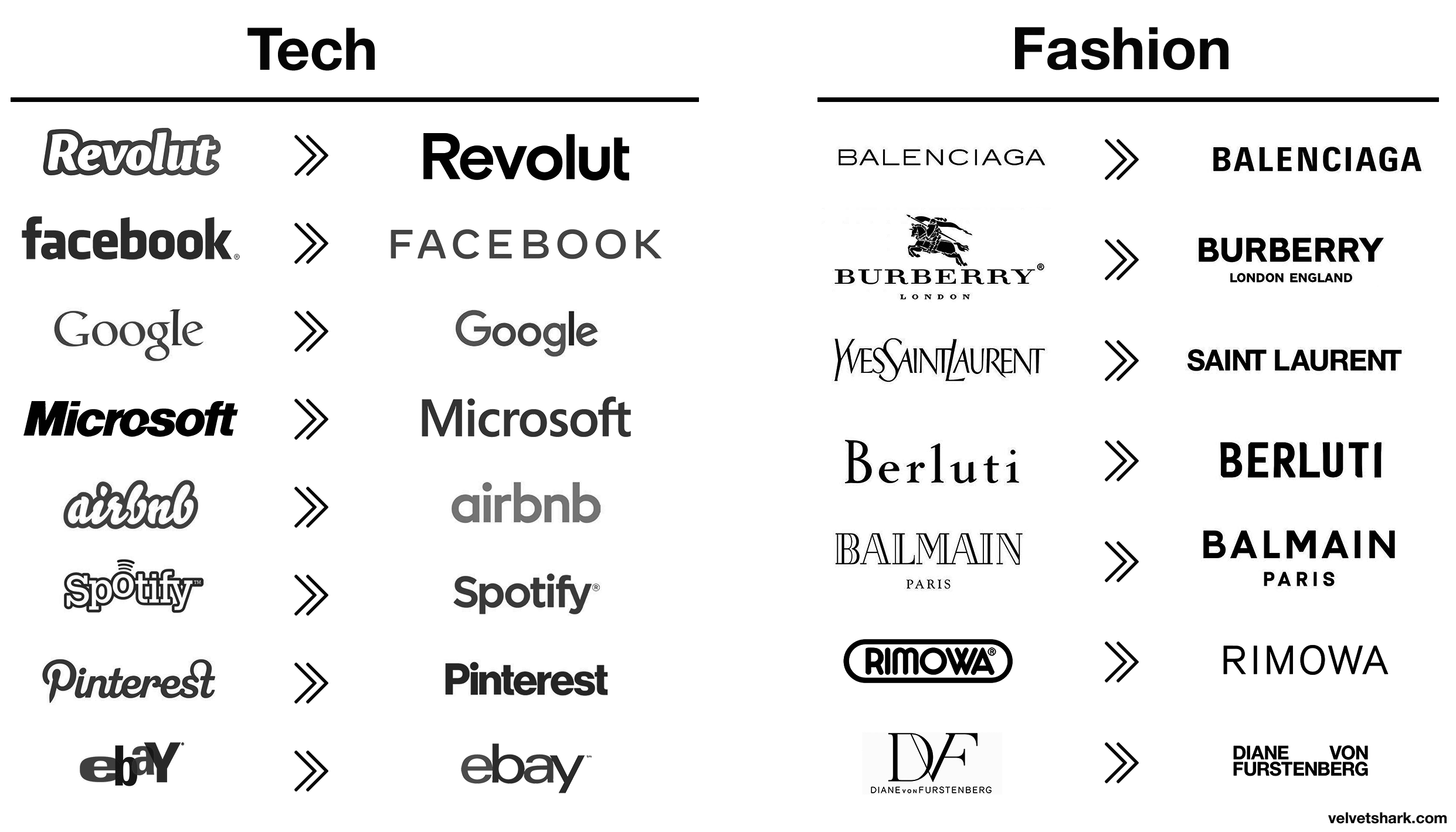
Basically, the same reason why so many brands change their logos and look like everyone else.

Design by committee
Another factor is how these logos are created. Important corporate decisions involve many stakeholders. The result is often the safest, most inoffensive option, the average of everyone's opinions. In design meetings at AI companies, conversations probably sound like:
- Can we make it more futuristic?
- It needs to feel advanced but approachable.
- Let's add a subtle gradient to convey intelligence.
No single person suggests making a logo that resembles an anus, but when everyone's feedback gets incorporated, that's what often emerges. Risk aversion in corporate environments naturally pushes designs toward familiar, "safe" territory, which apparently means anatomical openings.
What this says about tech branding
This phenomenon reveals something deeper about the tech industry: the fear of standing out too much. Despite claims of innovation and disruption, there's tremendous pressure to look legitimate by conforming to established visual language.
When OpenAI's sphincter-like logo became successful, it created a template that said, "This is what serious AI looks like." Now, any new AI company that doesn't resemble a colorful anatomical opening risks being seen as unserious or unprofessional.
Tech design trends through history
This isn't the first time tech design has gone through a conformity phase. Consider these previous waves:
- 1990s-2000s: 3D and Glossy - Remember when every logo needed a drop shadow and a glassy shine? Apple's aqua interface set the standard.
- 2010-2013: Skeuomorphism - Digital designs mimicking physical objects, with stitched leather textures and realistic dials.
- 2013-2018: Flat Design - Reaction to skeuomorphism brought minimal, clean interfaces with bright colors and no shadows.
- 2018-2022: Neomorphism - Soft shadows and semi-flat design creating subtle, "touchable" interfaces.
- 2022-Present: The Butthole Era - Circular gradients with central focal points dominating AI branding.
Each era started with innovations that were quickly copied until the industry reached saturation point and moved on to the next trend.

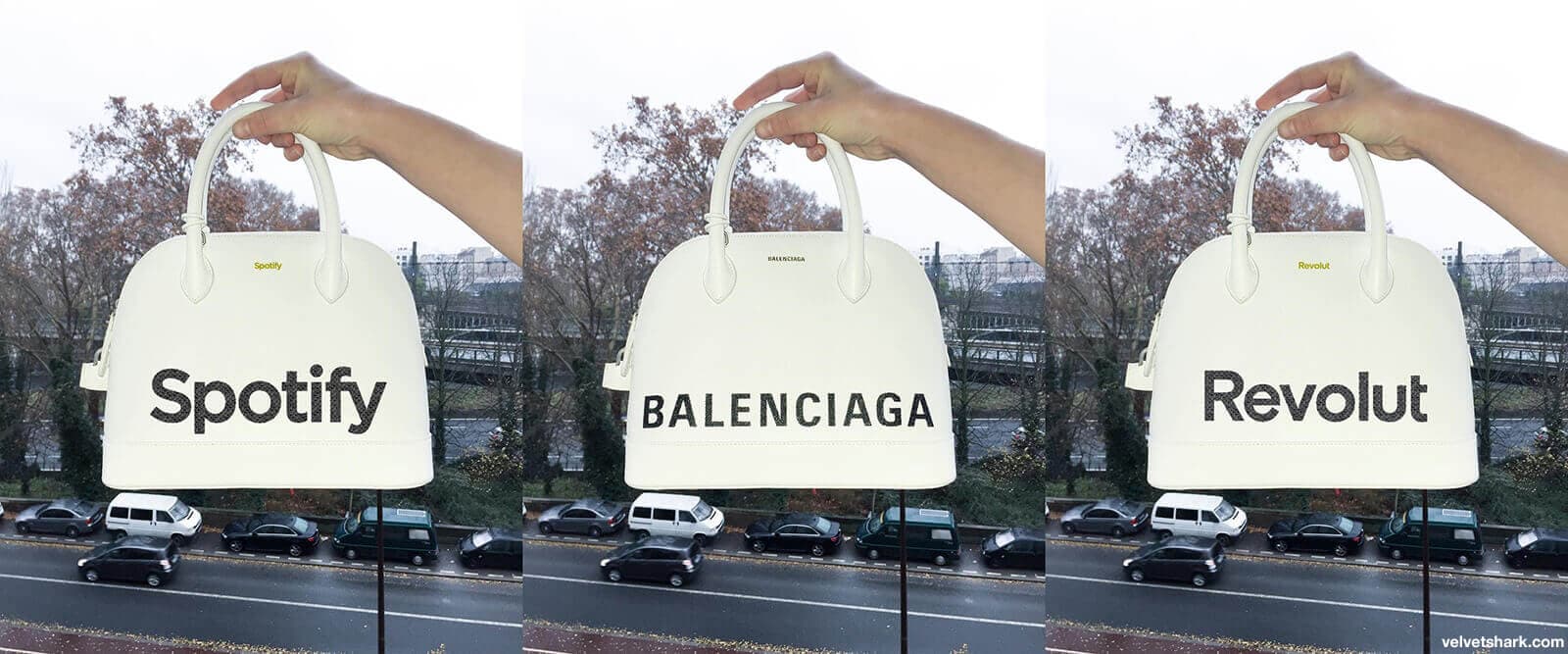
Logos become increasingly interchangeable (one of the bags is real, but they all look the same)
Historic logo disasters: You're not alone
AI companies can take some comfort in knowing they're not the first to face unintended anatomical comparisons. Logo history is filled with disasters but to keep this consistent with the theme of the article, here's a couple of them.

- Zune logo, when flipped, says something different. Maybe that's one of the reasons why iPod won?
- Brazilian Institute of Oriental Studies is a stylized pagoda silhouetted against the setting sun. Or so the designers wanted it to look. The final result was much more... anatomical. They since changed it to something less suggestive.
Maybe companies should have a panel of "middle schoolers" on their payroll to review logos before launch. They'll find every possible inappropriate interpretation with ruthless efficiency.
Breaking free from the butthole
For companies brave enough to differentiate, here are some alternatives:
- Embrace sharp angles - geometric shapes with defined edges create a distinct visual identity
- Use negative space creatively - think FedEx arrow, not biological openings
- Avoid radial symmetry - not everything needs to be perfectly circular
- Skip the gradient - flat design still works
- Test with diverse audiences - if five different people independently say "that looks like a butthole," it probably does (show it to teenagers if you want to uncover even the most subtle anatomical implications)
Conclusion
Does this mean AI companies should change their branding? Not necessarily. The familiarity clearly works in building trust. But perhaps the next wave of AI innovation could be accompanied by some visual innovation too.
For companies looking to break the mold, consider these approaches that successful tech brands have used:
- Embrace meaningful abstraction - Slack's hashtag-inspired logo communicates collaboration without circular clichés
- Leverage letterforms - Netflix's simple "N" has become instantly recognizable without anatomical confusion
- Tell a story - Stripe's distinctive parallel lines reflect payment flows moving seamlessly
- Use distinctive color combinations - Twitch's purple branding stands out in a sea of blue tech logos
The challenge for the next generation of AI companies isn't just technological - it's finding visual language that communicates innovation without resorting to the same tired sphincter-inspired patterns.
PS. This post is meant to be humorous, but let's not pretend there isn't a serious point here about the depressing sameness in modern design. No actual anuses were consulted during this research, though several designers were clearly thinking about them.
