Why do so many brands change their logos and look like everyone else?
A few months ago, I received an email from Revolut (a British fintech company) in which they proudly unveiled their new logo. Previously, Revolut had a distinct and instantly recognizable logo. They replaced it with… something I was sure I had seen before.

The previous Revolut logo had a unique font, a recognizable color gradient, and it was slanted. If you were to put 100 financial or tech companies’ logos next to each other, the old logo would be easy to find at a glance.
If you put the new one in the same 100 logos pile, it would drown in the sea of sameness.
Sans serif invasion
There is a trend in logo design that started around 2017-2018. It’s as if many companies decided that being unique was a handicap and that it was better to be like everyone else. Or at least, that’s how it feels to me.
The trend started with fashion logos. Many iconic fashion companies ditched their recognizable logos and switched to a bland and very similar version of a sans serif font.
The technology sector followed soon after.
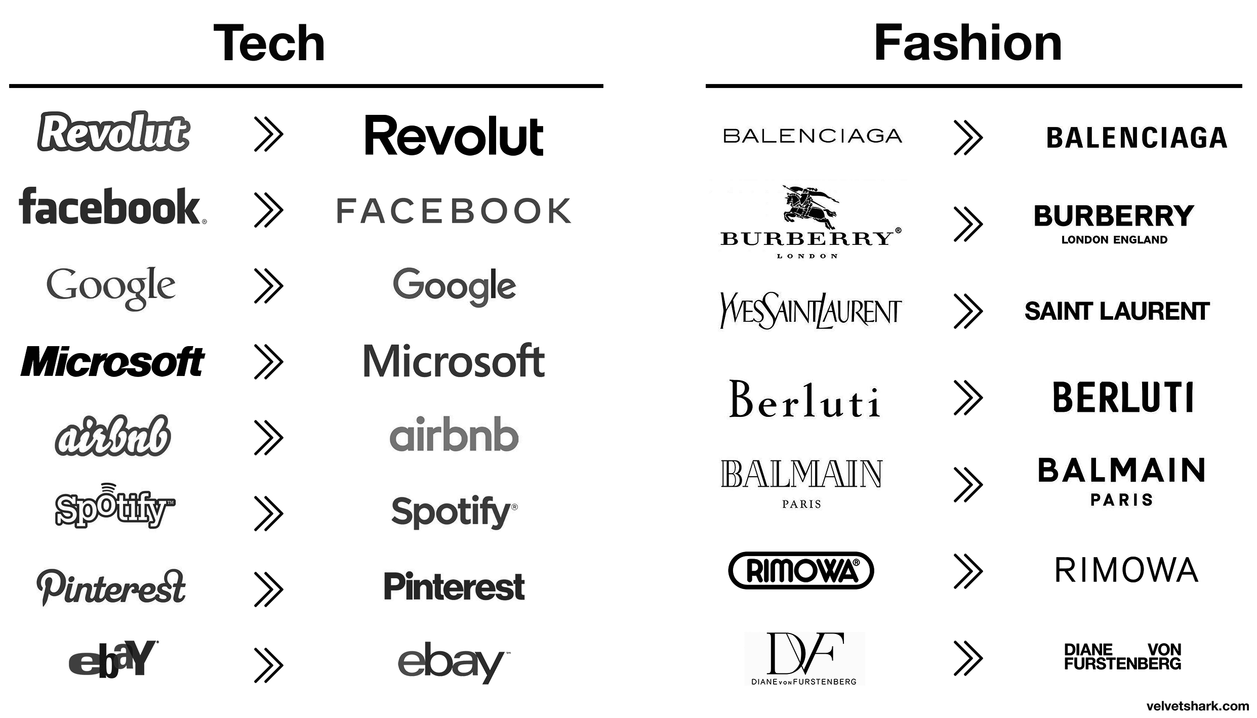
All the quirks, peculiarities, and idiosyncrasies of both tech and fashion logos were dropped and replaced with a simple sans serif font.
It looked like two huge industries decided to use the services of one designer, and not a particularly inventive one at that.
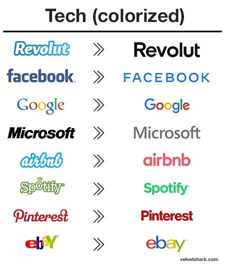
The tech industry is in slightly better shape because they didn’t go all in, and at least they kept the colors. With the colors, there’s at least *some *variability:
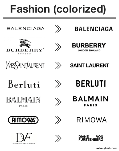
Variability in new fashion logos, in full color:
Serif and sans serif—what’s the difference?
First, what’s the difference between serif and sans serif fonts?
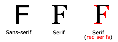
The small features on the ends of strokes in some fonts are known as ‘serifs’.
Fonts without those small features are called ‘sans serif’ (‘sans’ means ‘without’ in French).
Sans serifs are missing a few of the typical anatomical features (serifs, spurs, swashes and other flourishes). Because of that, this typeface lacks the level of detail and design differentiation that serif typefaces can have.
While the simplicity of sans serif fonts makes them readable and versatile, it has its drawbacks. Without additional details and features, sans serif fonts have far fewer options for differentiation. While you can vary things like the height, weight, and slant, sans serif fonts simply have fewer features to work with than their more intricate fellow fonts.
This results in logos that look very similar. Gone are all the elaborate little details of the previous era.
When you add brands’ tendency to go black-and-white, you end up with a sea of logo sameness which is the opposite of what logos should be.
The purpose of a logo is to be instantly recognizable, different, memorable, and, if possible, to refer to the brand’s values. Blending into everyone else’s achieves none of these things.
Sans serif history
Sans serif lettering and fonts, first created in 1816, were popular for their clarity and legibility at a distance in advertising and display use when printed very large or small.
Because sans serif type was often used for headings and commercial printing, many early sans serif designs did not feature lowercase letters.
Simple sans serif capitals, without the use of lowercase, became very common in uses such as tombstones of the Victorian period in Britain.
Also, a significant reason for serif faces in the older days of imprecise letterpress and less consistent paper surface sizing was to compensate for ink spread and aberrations. Serifs on the fonts helped in cases where corners would otherwise fail to fully imprint.
Possible reasons
What are the possible reasons for this sans serif trend taking over? And why do hardly any of them matter?
‘Modern utility’
Branding specialists point to the practical benefits of what they call the ‘modern utility’ of sans serif typefaces. Cleaner and more legible, they are better suited to a variety of media and work particularly well online. The purity of these fonts allows the brands to be an empty vessel, ready to accommodate rapidly shifting trends.
Counterpoint: That may be true, but isn’t the whole value of a brand to not be an empty vessel? The big brands have worked decades for their identity and recognition, only to throw most of it away?
Simplification
Another reason cited by brand specialists is that it’s a natural step for brands to take as they grow from scrappy startups into established brands. The goals have shifted from making noise and standing out to being a trusted, dependable part of people’s everyday lives. That heartfelt personality and idiosyncrasy that defined a brand as they started out, and won over their early adopters, can be a limitation as they aim for broad appeal and bigger revenue.
Counterpoint: Simplification as a reason to blend in for broad appeal? I don’t buy it. Logos should be simple, yes, but they should be simple in a memorable way. Think more in terms of Nike swoosh (simple, memorable), and less in a one-size-fits-all sans serif font.
Brands are more than logos now
People at the head of these powerful brands know that they are not defined by their logo anymore but by the product or service they provide. They are strong thanks to what they allow you to do with them.
Before, logo designers would look for a ‘concept’ when designing a logo. That is not necessary anymore: The brand is the concept.
Their thinking goes that logos may look similar, but what they offer is completely different and effective, and that’s what ultimately counts for the consumer.
As some brands become words (or even better, verbs) in our daily language (to Google, to Uber, to Skype), they have a lesser need for a recognizable logo. Many of those brands now spend on designing custom typefaces instead of logos: a custom typeface becomes their recognizable voice on every platform or device.
Counterpoint: Some big brands may indeed have a lesser need for a very distinct logo but that doesn't mean that they should get rid of an important differentiator. You don’t see Nike replacing their swoosh logo with sans serif NIKE text. If you have something valuable that you can live without, it doesn’t mean that you must.
Readability
One of the main reasons for the sans serif logo trend is readability. Especially on mobile, but everywhere else as well: from huge billboards to tiny footer links at the bottom of mobile websites.
After all, that’s the very reason why sans serif fonts were invented: for better readability in advertising headlines.
Counterpoint: Readability is obviously important. Mobile too—it’s where everything happens nowadays. But this is becoming less of an issue with improvements in technologies like retina displays and 4k screens becoming popular.
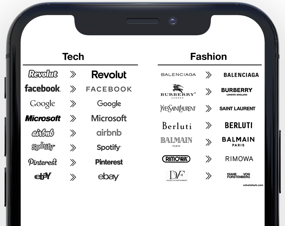
Here’s how a bunch of logos look on my iPhone 11
If it’s easy to fit 30 decently looking logos on one-third of a phone screen, it should be trivial to make one logo, however quirky, look perfect on mobile.
Revolut seems to be torn here. They did replace the logo everywhere inside the app, but how does their new app icon look like?
What next?
There’s nothing bad in wanting your logo to look simpler, better, mobile-ready, or universal enough to appeal to the broadest possible audience.
But don't throw the baby out with the bathwater.
Shoot for simplicity and legibility, but keep your distinguishing features. Don’t throw away what the brand has been working on for decades.
Otherwise, you may end up in a situation where you could slap any logo on any product and hardly anyone would notice a difference:
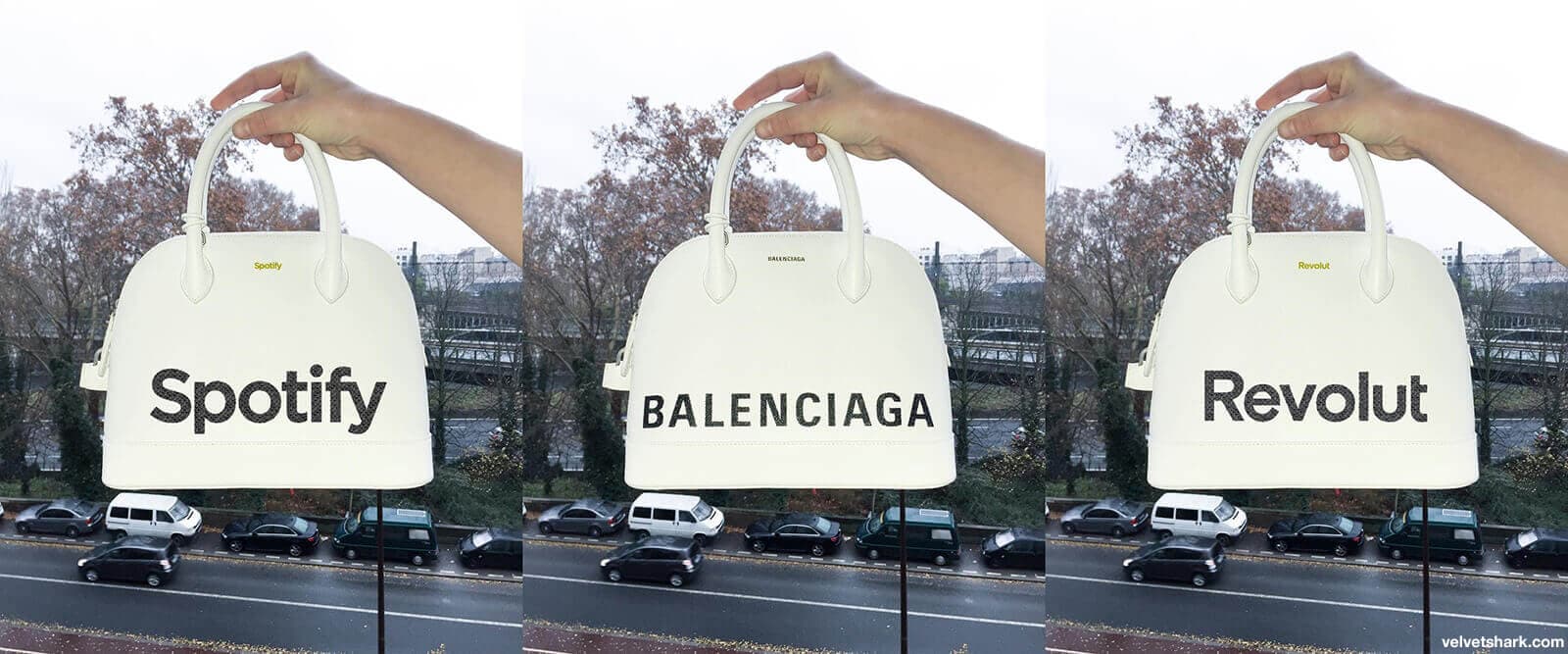
One of these bags is real.
